Dinastia (meaning dynasty in portuguese) is a marketing and social media agency that focuses on the fitness and beauty segments. We worked on a strong symbol that represents the brand on its own , combining a blackletter inspired D, reminiscent of regal eras, with two human silhouettes, representing beauty and fitness, two industries focused on the self, the individual.
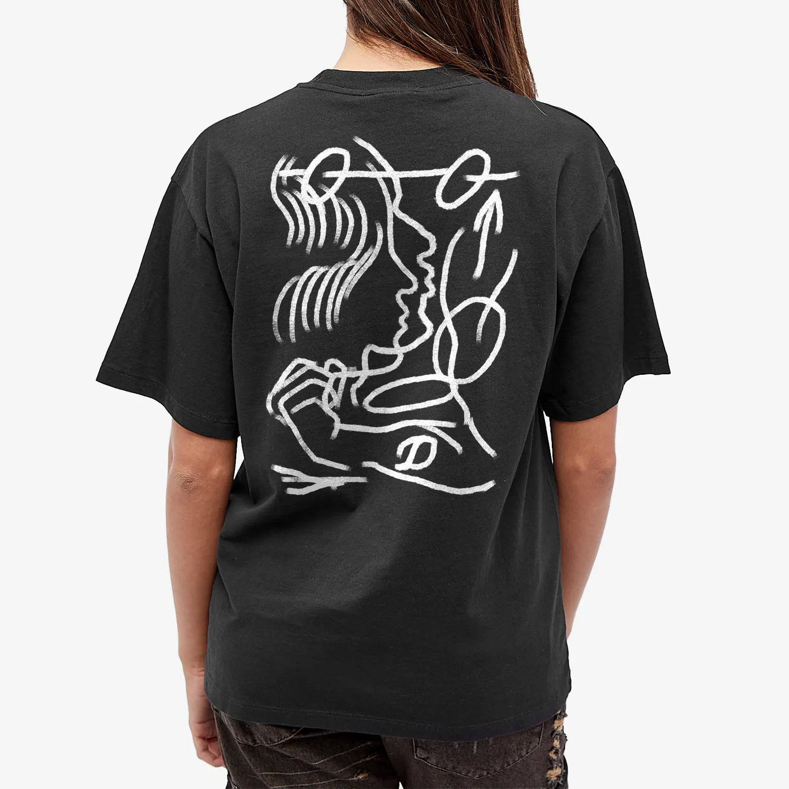
The logo is very dynamic and adaptable, having a simple version for most corporate uses, and a disruptive version, where there’s a hand drawn intervention.
The corporate logo also has many iterations, making it very flexible throughout formats.
The logo is very dynamic and adaptable, having a simple version for most corporate uses, and a disruptive version, where there’s a hand drawn intervention.
The corporate logo also has many iterations, making it very flexible throughout formats.